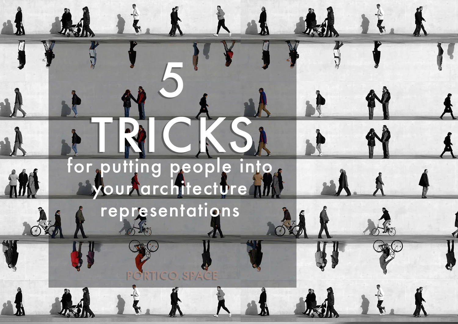
5 tricks for...putting people into your architecture representations
Architectural representation is,
And in may ways has always been, something of an art.
There are so many attributes of a building that you can try to describe or evoke through your representational work. From the form and scale, to the honesty of the materials, to more immaterial aspects, like the sense the space will give its users, the atmosphere, or the way the building responds to changing features like light or rain during the course of its lifetime.
But sometimes you can get carried away with the design of the building, and to fall into perfectionism with your representation of it. When this happens, it can be easy to overlook the other components of an image that are also hugely valuable.
At architecture school, representation is an important part of how we share our ideas with others, and how we set up a clear platform for feedback and commentary. A key part of this is really speaking to your audience.
So how do you invite you critic to imagine themselves occupying the spaces you have created?
How do you give you project scale, not just as a measurement, but as something meaningful to our experience of the world?
Put some people in.
Yes, you can also try pigs, pigeons, or plants - whatever other living things take your fancy. Superheroes seem to be strangely common in architecture school, and I wouldn't be surprised if we saw a few Pokemon popping up around the place.
Basically, you should be aiming to include something that occupies and gives life and scale to the spaces you are proposing.
Of course, people are preferable - because it makes it super easy for us to make the connection to how we would occupy the space ourselves.
5 Tricks to get your people looking convincing
01 | Scale

First up, get the scale right. People who are too small, or too tall for their position in the image can completely change how we understand a space - suddenly shrinking a hall, or turning a lobby into a vast cavern.
As a rule of thumb - women average about 1.65m height, men about 1.8m. Their eye level will be about 10-15cm below that. Know how high your floor-to-ceiling is as a reference, and size the people accordingly.
Hint: If you're having trouble doing this in photoshop, particularly with perspective images, a good idea can be to put a scale person (or even just a 1.8m high block) into your model, and export a screen shot which matches your render exactly. Use it as a guide to locate the real people you want to use in photoshop.
02 | Gravity
Sneaky hovering people can undermine your project. People can appear to be hovering when they are placed randomly throughout the image.
You should always be really clear about what you are putting people in for - what they are doing, and where they are doing it. A spray-gun effort doesn't often end well.
Wondering how to put your people in the right place in a perspective image?
If the image is taken from the perspective of someone standing in the room or space, then the eyes of any people you put in the image should be at the same level as the horizon line. So if they are further away, the are smaller, but their eyes stay at the same level - effectively just their feet move up.
Hint: Putting a little soft area of darkness under their feet can also help make them appear more grounded.
03 | Shadows
Once you've got your people on the ground, you need to pay attention to the environment you have created around them.
What is the light doing?
Will one side of their body be brighter than another?
What is the tone of the light (warm, cool, yellow, golden?)
Will they cast a shadow? (if they're in a shady place, there likely won't be light on them to cast another shadow)
Which direction will the shadow fall in?
Think about how shadows diffuse - they are sharpest close to the light source, and softer further away. You can use filters in photoshop to create a subtle blurring. And remember that unless your person is jumping or picking a foot up to walk, their shadow needs to be directly under their feet - no gaps between the person and the shadow!
04 | Colour & Tone
There's nothing more jarring than a green-toned person in a red-toned image. Even if everything else is perfect, they will stick out like a sore thumb and distract from the rest of your work. Even thought it seems like a small thing, you should think carefully about the saturation and colour profile of your people.
Integrating them into you image before you do the final photoshopping can help this - you can experiment with putting them beneath other tonal layers, or using photoshop to change their
colour balance;
saturation,
brightness,
levels,
or hue.
05 | Image style & fit
Have a good sense of the styling of the image before you start, and think about what types of people will best fit this.
Collage cut-out photographs of people can be great in futuristic work - a reference to Superstudio or Archigram.
Hand-drawn or sketched people
Silhouettes work well to communicate crowds, or people at a distance - but if too large the dark shape can put the composition out of balance.
Partially transparent people are useful for communicating both the space and the occupation, but
Realistic, opaque people that you've carefully cut out in photoshop make the project more realistic - but you have to put some time into getting them just right.
There's no right or wrong - but some styles of people will suit your project better than others. Don't just use silhouettes because that's your default, or you've seen everyone else doing it. Experiment - and get others to let you know what they think.