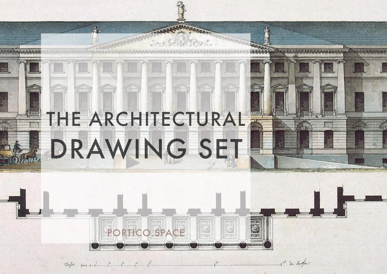
The Keys to a Great Architectural Drawing Set
Drawings are almost synonymous with the image of an architect, the professional with a large roll of blueprints tucked under one arm.
Architects produce drawings for a range of reasons, and use different drawings to communicate different things. At each different project stage in the Architecture Process, we make different drawings or enhance existing ones. At concept, rough sketches and diagrams are key. As we move into Preliminary and Developed Design, the drawings are measured, scaled, and square. In Detailed Design, in preparation for construction, tendering and Building Consent, drawings take on incredible density, including a high level of information and rigour.
A 'Drawing Set'
When we talk about a ‘ drawing set’, we are most often referring to these drawings produced ‘for construction.’
These are the pages and pages of different drawings, across a range of scales, which, when accompanied by a specification of all the materials, installation practices and nuts and bolts, which will be used by the construction contractor to turn the architectural idea into a bricks and mortar building. In my opinion, there are many different ways to put together a drawing set, and the results can look very different from practice to practice. But there are three things that are consistent.
for me, a good drawing set has three things:
completeness
clarity
cross-referencing
completeness
A drawing set includes everything that needs to be drawn to be understood, and the things which could be misunderstood in writing. This requires a lot of drawings, and is usually communicated through:
FLOOR Plans
Drawings looking down at the floor of each building, level and space, at a range of appropriate scales. A plan is usually produced as a 'cut' through the building at 1m above the floor level. Building Information is often separated out onto different drawings, including plumbing, lighting, roof, and structural drawings.
SITE PLAN
A site plan is like a bird's eye view showing how the building will be located, and how it will respond to the landscape or environmental factors around it.
ELEVATIONS
Elevations are flattened drawings of the exterior of the building, indicating what the building looks like on the outside, including materials, proportions, windows and doors.
SECTIONS
Sections are imagined ‘slices’ through the building, as if it were a loaf of bread, which reveal what the inside of a building looks like, and the components that make up the building ‘envelope’ or edge, and vertical dimensions & proportions.
DETAILS
Details allow us to zoom in to specific parts of the building to show how various materials come together. These are important for communicating between architect and builder. Although the drawing may be very intricate with many parts, a detail is often invisible in a finished building. Details bring together a range of thinking - from aesthetic, to weatherproofness, to construct-ability or how it all goes together.
Additional drawings might include:
Schedules of specific items, such as Doors & Screen and Windows;
Internal elevations of rooms, indicating materials and finishes, proportions, cabinetry and lighting.
Cabinetry drawings, showing how internal elements such as bathrooms cabinets, wardrobes and kitchens are to be constructed;
3D drawings to further explain any critical building parts & components.
2. clarity
A good drawing set is very clear, leaving nothing to the imagination. All the decisions, from design to materials and construction methods, are made, and included in the drawings. Importantly, there shouldn't be any contradictions from one drawing to the next.
To achieve clarity, it's very important that architects understand why they are making a drawing, and how the drawing will communicate. For more on this, see my post on Why Architects Draw here.
Clarity isn't just about the information in the drawings, it's also about how the drawings are made. This includes clear, regular and considered use of:
line weights and types;
scale;
annotation types and alignments;
layout, orientation and white space.
3. cross-referencing
Buildings are very complex, and individual drawings struggle to communicate this complexity on their own. We rely on the information being spread across a range of drawings, and subsequently, on people being able to shift between drawings to form a comprehensive picture of the whole.
To help people read across and between drawings, architects use a range of cross-referencing methods, including:
Page numbers (it seems menial, but makes a huge difference when talking at a distance). We usually break the drawing set down into chapter, typically by the drawing types outlined above, and give each chapter a Prefix number, and then a page number within that.
Section Call outs. To locate where a section 'cut' is taken, we draw a line through the plan, with perpendicular lines or arrows showing the direction the corresponding Section Drawing is 'looking'.
Elevation Call outs. There are often little arrows which act as 'eyeballs' located outside the building, looking towards the building face which is 'elevated' in the corresponding drawing.
Detail Call outs. For the very precise areas needing more information, boxes or circles indicate a 'zoom in' on a subsequent drawing.
Keynotes & Legends. A lot of information can't be drawn, and requires clear written descriptions. This type of written information is tied to the drawings through keynotes, which are short words or numbers which link to a legend where the reader can find more detailed information. Using these well also allows a drawing to breath rather than becoming completely hidden under text - something which anyone looking at a large number of drawings will welcome!
So that's it: clarity, completeness and cross-referencing - for me, the three tenets of a great architectural drawing set. Do you think anything else is important when putting together your drawings? Or is there something further you would like to know about Architectural Drawings in Professional Practice? Leave a comment below.


